Sunday, December 18, 2016

Lab 12: Processing UAS Data in Pix4D

Introduction

The purpose of this lab was to provide an introduction to the Pix4D software package.  This involved constructing a point cloud data set, a true orthomosaic, and a digital surface model (DSM).  Additionally, the software was used to calculate surface area, volume and to create a video animation.  

Pix4D Overview
Pix4D software was founded in 2011 and is "committed to creating professional, georeferenced maps and models from drone imagery" (Pix4D website).  Pix4D is currently the premier software for constructing point clouds.  The software is very user-friendly and is used in many industries such as surveying, construction, agriculture and real estate.  To get a quick overview of how to use Pix4D software, check out the video below:


Video 1: YouTube video detailing how to use Pix4D


Study Area

The study area for this project was Litchfield Mine.  Using a Phantom drone, imagery was collected over the mining area by the course instructor.  Only a portion of the total area surveyed was processed in this activity (see Figure 1).  


Figure 1: Study area shown in Pix4D; area inside red box used for processing

Methods

Processing in Pix4D
After learning a bit about Pix4D from the instructor and browsing through the software manual, it was time to gain hands-on experience.  First, a new project was created within the software.  68 drone images of Litchfield Mine were then imported into Pix4D.  

To cut down on processing time, a small subset of the total imagery was selected for processing (as shown previously in Figure 1).   In Pix4D, there are three choices under Processing Options: Initial Processing, Point Cloud & Mesh, and DSM, Orthomosaic, and Index.  First, only Initial Processing was carried out to ensure that everything was running smoothly.  After this processing was finished, a Quality Report is generated in Pix4D.  This report provides the user with information about the camera and images at hand (see Figure 2, Figure 3).  Figure 3 illustrates the high level of image overlap present, which bodes well for future processing.  Areas of low overlap are located on the edges of the study area, which will not be a huge problem for processing. 


Figure 2: Quality Report summary in Pix4D

Figure 3: Quality Report map of image overlap

Then, after the Quality Report was determined to be satisfactory, the other two processing options (Point Cloud & Mesh and DSM, Orthomosaic, and Index) were run.  These two processing functions took about 10 minutes to run.  Had the selected study area been larger, the processing would have taken much longer.  

After processing was complete, the results were used to do the following: 

  • Calculate the area of a surface within the Ray Cloud editor (Figure 4)
  • Measure the length of a linear feature in the Ray Cloud editor
  • Calculate the volume of a 3D object (Figure 5) 
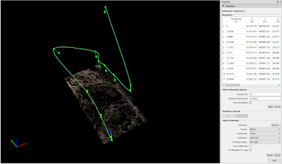
  • Create an animation that flies over the study area (Figure 6, Video 2) 


Figure 4: Screenshot displaying a surface area calculation in Pix4D


Figure 5: Screenshot showing a volumetrics calculation of a sand pile in Pix4D


Figure 6: Screenshot depicting an animation flight path in Pix4D

Video 2: Animation created in Pix4D showing "fly over" of study area


Processing in ArcGIS
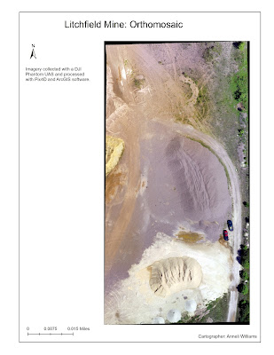
Upon completion of processing in Pix4D, the resulting DSM and orthomosaic were visualized in ArcGIS (Figure 7, Figure 8).  A hillshade was used in conjunction with the DSM to make the elevation differences more discernible.  

Figure 7: Map showing DSM of Litchfield Mine imagery


Figure 8: Map showing orthomosaic of Litchfield Mine imagery


Conclusion & Review of Pix4D


This exercise provided a great introduction to using Pix4D.  Judging from this basic activity, Pix4D appears to be an effective and easy-to-use software.  One major downfall of the software is the processing time, which could be extremely long for larger study areas.  Since many industries outside of the geospatial arena are using the software (for example, real estate), the user-friendly nature of the software is crucial.  Pix4D also provides lots of excellent online resources such as their Software Manual and Help to help less experienced users.  More experience with the software would be necessary to give a complete review.  

Tuesday, December 6, 2016

Lab 11: GPS Topographic Survey

Introduction

The purpose of this lab was to gain experience in collecting data with a high precision GPS unit.  The study area was a grassy knoll located on the UW-Eau Claire campus. 


Methods

In this lab, data was collected using a Topcon HiPer high precision GPS unit with a Tesla field controller (see Figure 1).  Due to complications with the geography department's ArcGIS account, the class was only able to collect 20 elevation points total.  Points were collected by two students at a time in a random survey throughout the grassy knoll.  Each student took a turn operating the Topcon HiPer and the field controller.  After all of the data was collected, the instructor was imported as a text file for future use in ArcGIS. 

To better visualize the elevation of the knoll, a number of interpolation methods were used, namely TIN, Natural Neighbor, Spline, IDW, and Kriging interpolation. 


Figure 1: Picture showing class members operating the Topcon HiPer

Results & Discussion

The results of the interpolations all were different, with various advantages and disadvantages.  To read more about the pros and cons of each interpolation method, check out Lab 5: Visualizing Terrain Survey.  The spline interpolation appears to provide the best visualization of the actual terrain. 

One of the main sources of error in the interpolation maps was the fact that the data was entered in as if it was in UTM Zone 16, when it should have been Zone 15.  This caused some distortion.  After importing the data as a text file, some of the fields were also mislabeled, which caused some confusion.  Despite this, all of the interpolations were performed successfully. 

Figure 2: TIN interpolation

Figure 3: IDW interpolation

Figure 4: Kriging interpolation

Figure 5: Natural Neighbor interpolation

Figure 6: Spline interpolation

Conclusion

This lab provided a good introduction to using a high precision GPS unit.  Ideally, each student would have been able to collect more than just two points to gain more experience, but the class made do.  Additionally, the UTM zone fiasco proved that it is important to be very careful when setting everything up for data entry on the field controller. 

Tuesday, November 29, 2016

Lab 10: ArcCollector & Bike Racks at UW-Eau Claire


Introduction

The purpose of this lab was to build upon the ArcCollector skills gained in Lab #9.  Each student picked a topic of their choice, formulated a research question, developed appropriate methods, and then went into the field to collect the data using an ArcCollector application on a smartphone.  

For this project, the research questions were: How are bike racks used on the UW-Eau Claire campus? How do variables such as rack location, rack type, and rack mobility influence rack occupancy?  To answer these questions, data was collected on the following variables: 

  • Number of Bikes
  • Rack Type (single or group)
  • Rack Mobility (mobile or permanent)
  • Rack Location (upper or lower campus) 

Study Area

The study area for this project was the UW-Eau Claire campus.  A college campus was chosen since universities often have more bicycle traffic than other areas because many students live nearby and biking can save on transportation costs.  Figure 1 displays the locations of bikes that were assessed.  While more bike rack locations exist on upper campus, many of them are located near residence halls.  Many students don't actually use those bikes on a day-to-day basis, but rather park them there for long periods of time.  Since these areas don't reflect daily use of bike racks, they were excluded.  


Figure 1: Map showing the study area

Methods

Data for this lab was collected using the Android ArcCollector mobile application on November 21st, 2016 around 11:00am.  Before heading into the field for data collection, a geodatabase and feature classes were set up in ArcMap.  A feature class was created for each criterion listed above as well as for notes.  Domains were used to avoid spelling errors and having to type in answers in the cold weather while in the field.  After the feature classes were properly set up, the map was uploaded to ArcGIS Online so it could be accessed by the ArcCollector mobile application. Then, data was collected on-campus with a smartphone (Figure 2, Figure 3).  


Figure 2: Screenshot of data points displayed on ArcCollector app

Figure 3: Screenshot of data input process on ArcCollector app

Results & Discussion

After finishing data collection, the results were mapped using ArcMap.  Figure 4, an interactive ArcGIS online map, conveys that the bike racks with the highest number of bikes are near Schofield/McIntyre Library, Centennial and Hibbard Hall.  This is not surprising since these areas provide the most space for racks.  Both the Schofield and Centennial bike racks were almost completely full.  These numbers are likely influenced by the fact that many classes are in session at 11:00am on Mondays.  


Number of Bikes by Rack at UW-Eau Claire
Figure 4: ArcGIS Online map depicting number of bikes per bike rack at UWEC

Figure 5: Picture of warning sign on mobile bike racks

Bike rack mobility was an interesting variable to consider, seeing as a notice had been posted on many mobile bike racks warning that they would soon be removed for the winter (Figure 5).  The photo of the notice was actually taken on Sunday, November 20th when data collection was first attempted.  Unfortunately, due to technological failure, not all of the data could be collected at that time.  Between Sunday at 11:00am and Monday at 11:00am, all of the mobile bike racks which had been marked with a notice had been removed.  Despite this, two mobile racks were still there on Monday, neither of which had a warning notice (Figure 6).  These two racks may have been left out for the winter since their location might not interfere with snow removal. 


Figure 6: Map depicting bike rack mobility at UWEC


 Two main types of bike racks exist at UW-Eau Claire: u-shaped single bike racks and traditional long racks.  When examining Figure 7, one can tell that the single racks are far more prevalent on-campus.  This data is, however, affected by the fact that many of the "mobile" racks which had already been removed were also traditional "group" racks.  Additionally, the bike racks near the newer buildings--Centennial and Davies Center--were almost all single racks, suggesting that the university might be moving towards this model.  Having single racks which don't need to be removed in the winter could save money on removal costs.  
Figure 7: Map depicting bike rack type at UWEC


Conclusions

This exercise was very valuable in gaining experience with setting up and deploying a project in ArcCollector.  While the data was effective in answering the research questions, it would have been more useful to gather the data before the mobile bike racks were removed for the winter.  In fact, it would have been interesting to assess all of the bike racks both before and after those racks were removed to compare and contrast the findings.  This project could also be expanded by completing the same exercise at different points in the day to track when students are using the bike racks most often and which locations on-campus might need more bike racks. 

Tuesday, November 15, 2016

Lab 9: ArcCollector & UWEC Microclimates

Introduction

The purpose of this activity is to provide an introduction to gathering geospatial data on a mobile device.  Since modern mobile devices (smart phones, tablets, etc.) have more computing power than GPS units, it is only logical to use these mobile devices for GPS data collection instead of stand alone GPS units.  Using mobile devices is also advantageous in that they are connected to the internet, so data can be instantaneously uploaded.  

In this case, a mobile application called ArcCollector was used to gather data about the microclimate of the UW-Eau Claire campus.  The variables collected were temperature, dew point, wind speed, and wind direction.  The campus was divided into five different zones, teams of two students each were distributed evenly among the zones (Figure 1).  Each team possessed at least one mobile device with the ArcCollector application, and these teams collected data simultaneously about the weather conditions at the UW-Eau Claire campus on Wednesday, November 8th, 2016.  Kyle Mundth and myself were assigned to Zone 1.  

Figure 1: Map displaying five zones on UW-Eau Claire campus
for data collection


Methods

Figure 2: Anneli using the Kestrel 3000 to collect
dew point data
First, in order to facilitate data gathering, each student downloaded the ArcCollector application for Android or Apple on their smart phone.  Then, using ArcGIS Online, the students accessed a base map with all five zones that had been created by the instructor.  Each team of students was asked to gather approximately 20 points from the zone to which they had been assigned.  

 The following equipment was used in the field for data collection: 

  • Kestrel 3000 Wind Meter
  • Compass
  • Smart phone (ASUS Zenfone 2)
At each site, the Kestrel 3000 Wind Meter was used to measure the temperature, dew point, and wind speed (Figure 2).  Then, the compass was used to assess the wind speed (Figure 3).  

Figure 3: Kyle using the compass and his phone to assess and record wind direction

All of this data was recorded in the ArcCollector application on a mobile device (Figure 4, Figure 5).  When data was collected from a particularly noteworthy site, a brief explanation was provided in the "notes" section of the point in ArcCollector.  Additionally, photos were attached to some points.  During the data collection process, all of the other groups' data appeared in real time as it was collected on the ArcCollector application.  

Figure 4: Screenshot of ArcCollector on Anneli's phone

Figure 5: Screenshot of ArcCollector parameters for data entry on Anneli's phone


Results & Discussion

After data collection was finished, the resulting data points were brought into ArcGIS for geovisualization and analysis.  The first two maps examine temperature and dew point within the five zones (Figure 6, Figure 7).  Both the coldest and warmest temperatures appear to be in Zone 3 (southeast corner of study area), though Zone 2 also displays some of the warmest points.  Since the most extreme measurements almost all occur in the same area, it might be worth examining the methodology of the teams that collected data for Zone 2.  Perhaps these teams purposefully chose certain areas, such as locations near heating or cooling vents, to achieve these values.  Additionally, their equipment may have been a source of error.  

Figure 6: Map showing temperature data from ArcCollector


Figure 7: Map showing dew point data from ArcCollector


Wind speed and direction measurements are shown in the third map, though it is harder to make out any sort of pattern (Figure 8).  Greater wind speeds are seen at locations such as the foot bridge and on top of the hill near Hilltop Center, which is to be expected due to lack of wind blocks and elevation respectively.  Since each team was simply given a compass with no explicit instructions on assessing wind direction, errors are likely to have occurred.  If points had been collected at more regular intervals, or if the data was interpolated for the entire study area, a better analysis could be carried out. 

Figure 8: Map showing wind speed and direction data from ArcCollector

Conclusions

This exercise highlighted the incredible advantages of utilizing mobile devices for geospatial data collection.  The ArcCollector application itself was both easy to use and effective in accurately gathering data in the field.  Since most people already carry a smart phone or tablet with them at all times, applications such as ArcCollector are very convenient for field work.  Additionally, the ability for multiple people to gather data at the same time and upload it to the same map is valuable for team projects.  Moreover, since both the Android and Apple applications of ArcCollector were free to download, this method of data collection could be cost effective for lower budget organizations.  


Tuesday, November 8, 2016

Lab 8: Map & Compass Navigation

Introduction

In this activity, students utilized maps, compasses, and a Trimble Juno 3 GPS device to navigate to a series of points at the Priory.  The maps used were created in Lab 7, and the compass and GPS devices were provided by the instructor.  The class was split up into six different teams of students, and each team was given a set of latitude/longitude coordinates to be located. 

Methods

At the beginning of this exercise, the instructor gave each team of students a set of five coordinates.  These points were then plotted on the printed maps (points for Group 5 are shown in Figure 1). 

Figure 1: Map with Group 5's points plotted (Photo: Amanda Senger)

For this exercise, three navigation tools were used: 
  • 2 Maps of the Priory: UTM, GCS
  • Trimble Juno 3 (Figure 2)
  • Compass
    Figure 2: Trimble Juno3 GPS (Photo: Laura Hartley)


After distributing the navigation tools, the instructor demonstrated how to use the compass and map together (Figure 3).  Each student also measured their "pacing" by counting steps along a 50 meter long tape measure. Though the map, compass, and pacing combined provided general direction and distance for navigation to the points, the GPS device allowed for double-checking of locations. 


Figure 3: Dr. Hupy demonstrates compass & map navigation (Photo: Amanda Senger)

Then, each team put their navigation skills to the test and set out to find their first points.  The map and compass was used to find the bearing from the Priory parking lot to the first point (Figure 4).  Before leaving the parking lot, each group also turned on the tracking feature on their Trimble device in order to gather data about their route for later use.  

Figure 4: Compass & map navigation (Photo: Amanda Senger)

When in the field, each team member took on different roles (Figure 5, 6).  Amanda served as the primary compass and map navigator, and figured out the direction the runner needed to go.  Jeff served as the primary runner, and followed Amanda's directions to scout out ahead of the group.  Anneli served as the note taker, recording and calculating distances and directions.  Jackie served as the GPS operator, and used the device to double-check the group's trajectory and final destinations.  Anneli and Jackie also served as pacers, and used the map's scale and their previously calculated pace to determine approximate distances to points. 

Figure 5: Jeff as runner, Anneli as note taker, Jackie with GPS

Figure 6: Anneli and Jackie as pacers (Photo: Amanda Senger)


Discussion

One of the main problems encountered in this activity was dealing with terrain.  While the compass, map, and pacing alone might have worked for a flat field, our terrain was fraught with trees, bushes, hills, and ravines.  This made pacing difficult and navigating in a straight line nearly impossible.  Another problem that occurred was a missing destination point marker.  After searching for quite some time, Group 5 determined that the Point 2 marker must be missing and added their own to a tree near the given coordinates (Figure 7).  

Figure 7: Jeff marking Point 2 (Photo: Amanda Senger)


Results

A map displaying Group 5's destination points and tracking points is displayed below (Figure 8).  

Figure 8: Map displaying Group 5's track log and destination points

 Conclusions

Despite the troubles with terrain, this activity proved very valuable.  Though many people rely heavily on advanced technology for navigation purposes, technology can fail.  For this reason, it is important to also know how to navigate with more primitive devices such as maps and compasses. 

Tuesday, November 1, 2016

Lab 7: Navigation Map Construction

Introduction

The purpose of this exercise was to create two navigation maps for future use.  Navigation itself requires two different things, namely tools for navigation and a location system.  Tools for navigation can range from the sun and stars to GPS devices and other technology.  Location systems rely on coordinate systems and projections, with the varieties depending on the data at hand and purpose of the project.

Study Area

The study area for this exercise is the Priory, an area of land owned by the University of Wisconsin-Eau Claire that is home to a student dormitory and children's nature preserve.  The Priory is located about 3.4 miles away from the UW-Eau Claire main campus (Figure 1, Figure 2). 

Figure 1: Map illustrating route from UW-Eau Claire to the Priory (Google Maps)

Figure 2: Map showing the Priory property (Google Maps)


Methods

Two maps were produced using ArcMap, each using a different coordinate system. Both maps also feature a properly labeled grid, 5 meter contour lines, and background imagery.  The first map uses the Universal Transverse Mercator (UTM) Coordinate System and the second map uses the Geographic Coordinate System (GCS)  and decimal degrees.  Each coordinate system is discussed in greater detail below. 

UTM
The UTM Coordinate System divides the world into sixty different zones, each with a width of six degrees longitude.  The zones which lie within the continuous United States are outlined in Figure 3.  For the first map produced in this exercise, the coordinate system NAD 1983 UTM Zone 15N was used, since it corresponds with the location of the study area.  Furthermore, the projection used was Transverse Mercator.        
Figure 3: Map detailing UTM zones in the US (Wikipedia)
GCS
The GCS designates locations using latitude, longitude and decimal degrees (Figure 4).  For the second map produced in this exercise, GCS WGS 1984 was used.  There is not a projection associated with this map, since the geographic coordinates of the GCS are unprojected.  Due to the small study area, distortion is readily apparent in the map.  


Figure 4: Diagram showcasing GCS and decimal degrees (www.shsu.edu)

Results & Discussion

The following maps were produced using the aforementioned UTM and GCS coordinate systems (Figure 5, Figure 6).  While both maps have value, the map created using the UTM coordinate system is more practical for actual use in the field.  On the other hand, the GCS map is quite distorted, making it harder to discern contour lines and earth features.  Additionally, decimal degrees are not useful when one is navigating on foot in terms of calculating distances.  
Figure 5: Navigation map using UTM

Figure 6: Navigation map using GCS

Conclusion

This exercise provided a valuable introduction into creating navigation maps.  While technology is often used today for navigation purposes, smart phones and devices can and do fail.  It is never a bad idea to also have a physical map at hand for navigation.  One challenge for the creation of both maps was deciding how to make a map that was effective while not being too busy.  This issue was addressed by using a somewhat transparent background, contrasting colors, and widely spaced, clearly labeled contour lines.  The true efficacy of the maps will be tested in the field next week. 

Tuesday, October 25, 2016

Lab 6: Distance Azimuth Survey

Introduction

In this exercise, the class was provided an introduction to distance azimuth surveying.  This method of surveying is no longer commonly used, as it has been replaced by more sophisticated GPS technologies.  Despite this, possessing knowledge about distance azimuth surveying can be very useful in the case of technology failure, since it does not require many tools and can provide reasonably accurate results.  

For this activity, trees in Putnam Park were surveyed by small groups of students usually various equipment such as a compass, measuring tape and TruPulse 200 laser distance finder.  

Study Area

The study area for this activity was Putnam Park, a natural area located behind the University of Wisconsin-Eau Claire.  Trees at three different sites were assessed (Figure 1).  At each site, ten trees were surveyed from the same point.   

Figure 1: Study area for azimuth distance survey


Methods

At the beginning of this exercise, the instructor introduced all of the students to each piece of equipment.  Due to the limited amount of equipment, small teams of students then took turns assessing trees at three different sites.  At each of these sites, the following data was collected for approximately 10 trees: 

  • Latitude and longitude of site
  • Distance: from control point to tree
  • Azimuth: from control point to tree
  • Tree Diameter: measured at breast height
  • Tree Type (if identification was possible)

These attributes were chosen collectively by the class and instructor before data collection began.  It was determined that these attributes were most important for future analysis and eventual map creation.  After recording all of this data in the field, the data was entered into a spreadsheet (Figure 2).  


Figure 2: Table of data collected


Results & Discussion

The resulting data of this exercise turned out fairly well.  Although the table of attribute data is by no means perfectly accurate, it provides basic information about the trees in Putnam Park.  One major source of error in this lab is the fact that different students assessed each attribute, each with more or less accuracy.  Moreover, the equipment available at each site was different, which likely affected the accuracy of measurements.  For example, all of the measurements completed at Site 2 were done with the TruPulse, while many of the measurements at Site 3 were taken using the compass.  Another problem during this lab was tree identification, since many students had little experience in this area.  As a result, some trees surveyed may have an incorrect "Tree Type" attribute, which could cause problems if anyone else tried to locate these trees in the field.  

Conclusion

While distance azimuth surveying is no longer commonly used by geographers, it is still a very practical skill to know.  Though geographers are increasingly reliant on sophisticated technology, older basic methods are valuable as well, especially in the case of technology failures.  This skill is also valuable if more expensive technology is not accessible.  For example, the instructor shared a story in which his GPS technology was seized at an international airport.  

Tuesday, October 18, 2016

Lab 5: Visualizing Terrain Survey

Introduction

In Lab #4, a terrain was created in a sandbox and its elevation was assessed using surveying techniques (refer to previous blog post for more details).  
Figure 1: Normalized table

This lab will serve as a follow-up to the survey conducted last week.  Data normalization played a large role in preparing the data that was collected last week for visualization.  According to ESRI, data normalization is "the process of organizing, analyzing and cleaning data to increase efficiency for data use and sharing" (ESRI, 2016).  In this lab, the elevation data that was collected during the survey had to be normalized in Excel before it could be imported to ArcGIS.  This meant making sure all of the columns were properly sorted and changing the data to be set as 'numeric' with proper decimal values.  After this was done, the data could be imported into ArcMap and converted into a point feature class. 


Methods

After importing the data into ArcMap, it was visualized using five different interpolation techniques.  According to ESRI, interpolation is "the estimation of surface values at unsampled points based on known surface of surrounding points" (ESRI, 2016).  Here are the interpolation techniques that were used in this lab, as explained by ArcHelp and ESRI: 

  1. Inverse Distance Weighted (IDW)
    Definition: An interpolation technique that determines cell values using a linearly weighted combination of a set of sample points, wherein the weight is a function of inverse distance.
    Advantages: Can control "power parameter" which determines significance of known points; can limit number of points used for interpolation to speed up processing time
    Disadvantages: Quality of interpolation can be limited if points are unevenly distributed
  2. Natural Neighbor
    Definition: A deterministic interpolation method for multivariate data in a Delaunay triangulation; value for interpolation point is estimated using weighted values of closest surrounding points in triangulation.
    Advantages: Well-suited for categorical data
    Disadvantages: Interpolated heights are guaranteed to be within range of samples, so it will not display peaks, ridges or valleys that aren't represented by sample points
  3. Kriging
    Definition: A geostatistical interpolation technique in which the surrounding measured values are weighted to derive a predicted value for an unmeasured location.
    Advantages:  Can provide insight on precision of predictions; appropriate when there is a spatially correlated distance or directional bias in data; well-suited for soils, geology
    Disadvantages: Z-values must be assessed prior to interpolation to determine if Kriging is appropriate
  4. Spline
    Definition: A deterministic interpolation method in which cell values are estimated using a mathematical funcation that minimizes overall surface curvature, resulting in a smooth surface.
    Advantages: Works best for gently varying surfaces
    Disadvantages: Not desirable if smooth surface isn't wanted
  5. Triangular Irregular Network (TIN)
    Definition: A vector data structure that is comprised of contiguous, non-overlapping triangles, wherein the vertices of the triangles are sample data points (x, y, z).
    Advantages: Non-redundant data, can use natural features as break lines; can accommodate more or less complex data with varying triangles
    Disadvantages: Less tools available for processing than for raster data
After applying each interpolation method to the data, the resulting surface maps were imported into ArcScene for 3-D visualization.  Then, the resulting 3-D renderings were exported as JPEGs.  

Results & Discussion

The 3-D visualizations of the survey data using all five interpolation techniques are displayed below (Figure 3, Figure 4, Figure 5, Figure 6, Figure 7).  After viewing all of the interpolations somewhat head-on, side views of each were compared as well (Figure 8).  This helped to determine which interpolation was the best fit for the data at hand.  


Figure 2: Sandbox terrain for comparison with 3-D visualizations
IDW:
This 3-D visualization was one of the worst results, owing to its bumpy appearance which distorts the true nature of the terrain elevation (Figure 3).  The terrain was not nearly this uneven in real life.  
Figure 3: 3-D visualization of IDW interpolation
Kriging: In comparison to the other four results, the Kriging visualization turned out to be the best (Figure 4).  This depiction is much smoother than IDW, and shows a more realistic representation of the depressions, ridge and hill in the terrain.  

Figure 4: 3-D visualization of Kriging interpolation
Natural Neighbor: While this visualization provides a rough interpretation of the surveyed terrain, its edges are somewhat rough (Figure 5).  Additionally, the depressions are not as well defined as other representations like Kriging. 
Figure 5: 3-D visualization of Natural Neighbor interpolation
Spline: The Spline visualization offers the smoothest depiction of the terrain, though in places it appears almost too polished (Figure 6).  Despite this, it stands as one of the best representations of the actual terrain.  
Figure 6: 3-D visualization of Spline interpolation
TIN: Although the TIN visualization depicts all of the intracies in elevation data well, it is rather jagged in appearance (Figure 7).  The complexity it portrayed distracts from providing a comprehensive look at the overall terrain.  

Figure 7: 3-D visualization of TIN
Side Views: Comparing the side views of all five representations reaffirms the aforementioned assessments of the results (Figure 8).  Kriging and Spline still appear to be the most effective visualizations for the terrain.  
Figure 8: Side views of all five interpolations


Conclusion

This survey relates to other field based surveys in that it was an exercise in assessing an area based on a sampling of data.  Though the study area for this exercise was small, the same methodology could be applied at a larger scale.  Using surveying techniques can be a way to save time and money, though it is important to use appropriate and effective techniques to survey the area at hand.  For example, in this terrain survey, it made sense to use intervals of 5cm for the survey grid, however, a larger survey area may require larger increments.  After collecting data in the field, a number of interpolation techniques can be applied to assess the study area.  An element of experimentation may be involved in picking the most fitting interpolation method for the data.  For example, in this exercise, the Spline interpolation appeared to be most suitable, but the TIN interpolation might be more suitable for a project in which the surveyors are concerned with expressing the complexity of the elevation changes.  Other terrain surveys may also benefit from supplemental data from remote sensing techniques or drone technology.  While field based surveys are very useful tools, it is always important to remember that such surveys contain elements of error.  It is impossible to survey every single point of a study area, and interpolation and visualization methods also influence results.